The font of the text "Detox" stamped onto the front cover in a orange stamped font makes it look unique therefor standing out from the rest of the cover because the rest of the cover is in black and white. It gives the main artist Dj rukiz the main focus of attention because his name is the only one mentioned. The stamped on album name "DETOX"is a an example of the vocabulary used it gives the idea of drugs/prison/hospital, without actually talking about it.
You can see that position signs were considered when they were shooting for this album cover. The camera is positioned in the center of the shot with a low angle looking up towards the artists. With all the artists in the same sight lines as the audience. By doing this it makes the artist look powerful and has ownership over the audience especially as each artist has a very serious facial expression. The girls acts as symbol in this picture and has great significance. Her facial experession is quite smug and happy that she is the prize all the men around her are fighting for. Content signs can be seen through Mise en scene and communicates a message to the audience. The girls low cut strapless top (also creating sex appeal) and the mans watch, silver chain, flat peak and gloves suggests that they are stylish and very much care about their costume. The man in the background wants to stay hidden and one of his eyes is covered by his flat peak this shows he wants to watch but wants to stay unseen. Archetypes are also used in the front album cover shown my all the artists holding a masculine pose for example broad shoulders and arm around the girl.
Low key lighting is used and creates a dark shadowed look around the edges of the picture but gives the main image a high contrast light in the center of the image.
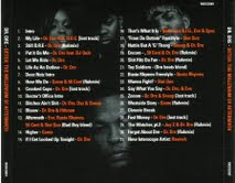
 The the back of the album cover and the disc are mostly black except for the text. This is becuase the album content is dark involving songs about death, money and violence.
 The artisits faces here are very shadowed suggesting that they are like ghosts but always watching, almost like they are haunting, and they should not be forgotten.
The Mise en scene throughout all images are what would expect as they follow the usual conventions of a hip hop group. The baggy T shirt, flash jewlery, baseball cap and tattoos.
Low angle shots are often used on the covers awell to show they control and have power over the audience.


No comments:
Post a Comment